.png)
Moksha
Old Age Home
Users of the Moksha Old Age Home website struggle to navigate, find crucial information about elderly care services, and complete important tasks like making donations. The project focused on streamlining navigation, optimizing information architecture, and creating an better communicate Moksha's services, facilitate informed decision-making, and simplify the donation process.
Client: Moksha Old Age Home
Project Duration: Aug 2023 to Nov 2023
Team: 1 UX Researcher and Designer (myself)
UX Activities / Heuristic Evaluation, User Research, Persona Creation, Usability Testing, Prototyping, User Flow Mapping
Background
Moksha Old Age Home provides elderly care services and relies on its website to communicate with potential residents, their families, and healthcare providers. As the sole UX Researcher and Designer on this was my responsibility to improve the website's usability and user experience to better serve its audience and support the organization's goals.
.png)
Defining the Problem
Initially, stakeholders assumed that simply adding more information to the website would solve the usability issues. However, I advocated for a more comprehensive approach, pushing for in-depth user research to understand the underlying problems and users.
I conducted usability tests and interviews to build empathy with our users and better understand their pain points when interacting with the website. These sessions focused on how users navigated the site, searched for information, and attempted to complete key tasks such as finding services or making donations.

Goal-Oriented Design
The previous interface was bloated and inconsistent, featured vague calls to action, and lacked contrast and hierarchy. Cleaning up the interface, introducing a coherent design system, and providing clarity as to what the data and actions represent helped drive a significant increase in engagement.
Initial Thinking
Target Users:
-
Potential residents of Moksha Old Age Home
-
Family members of potential residents
-
Healthcare providers
Research Methods
-
Heuristic Evaluation using Nielsen Norman Group's 10 Usability Heuristics
-
Usability testing with target users
-
Thematic analysis of findings
-
Prototype high-fidelity wireframes
Research Questions
-
How might we design an intuitive navigation system that allows users to easily find and access services with minimal effort?
-
How might we streamline the donation experience to make it straightforward and user-friendly, encouraging more users to contribute?
-
How might we create a visually cohesive and professional website that instills trust and engages through consistent design elements?
Research
Research Goals
-
Identify usability issues on the Moksha Old Age Home website
-
Analyze user perception of the website's design and information architecture
-
Examine the impact of website design on user trust and decision-making
-
Evaluate the effectiveness of the navigation and content organization
-
Identify the strengths and potential improvements of the current system
Empathize
While analyzing the user experience issues on Moksha Old Age Home's site, I identified a recurring theme of frustration caused by poor and lack of detailed information.
As a researcher and designer, I drew on my understanding of elderly care websites and user expectations to comprehend how these design flaws impact potential residents and their families. This insight was crucial in shaping my approach to improving the site's usability and information architecture.
I focused on how issues such as inconsistent design, lack of clear navigation, and insufficient information create confusion and hinder users from making informed decisions about elderly care options. By reflecting on these user challenges, I developed my main design recommendations to enhance clarity, improve navigation, and provide more comprehensive information about Moksha's services.


Heuristic Evaluations
Persona Creation
 |  |  |
|---|
 |  |  |
|---|
Usability Test Dashboard

Usability test focus area
Address poor website structure causing difficulty in finding information.
Aim to enhance user experience for potential residents, families, and healthcare providers.
1
Improve the website's unp and ineffective use of white space.
Enhance readability and user experience through better design principles.
2
Tackle the lack of detailed information, especially on pages with only images.
Ensure comprehensive and accessiblecontent throughout the website.
3
User Interviews
I conducted in-depth interviews to gain deep insights into user behavior and pain points.
Number of participants: 5
Duration of each interview: 45 Minutes
Mode: Online | Zoom
Key Questions
-
What are your primary goals when visiting the Moksha Old Age Home website?
-
How would you rate the ease of finding information on the website, on a scale of 1-10?
-
What aspects of the website's design and functionality would you improve?
-
How likely are you to recommend this website to others seeking elderly care options?
This approach allowed me to gather qualitative data on user needs, preferences, and pain points, informing my redesign strategy for the Moksha Old Age Home website.
Key Insights from User Interviews:
.png)
80%
of participants struggled to find information easily on the website
40%

of users were unlikely to recommend the website to others seeking elderly care options.
70%

of participants reported difficulty finding detailed information about services and amenities
View the in-depth User testing data
Quantitative Research
To gather measurable data on user behavior and preferences, I conducted an online survey with 25 participants who had interacted with the Moksha Old Age Home website.
Screener Criteria
-
Age: 30-50 years old
-
Familiarity with elderly care websites
-
Recent experience searching for old age home information
-
A mix of urban and rural respondents
72%
of users struggled to find detailed information about services
68%
of users desired updated images and virtual tours of facilities
80%
75%
of users found the website navigation confusing
of users wanted clear pricing and payment information
45%
of users expressed interest in reading resident testimonials
56%
of users felt the website lacked trustworthiness
Recommendations
1. Implement Data-Driven Navigation: Redesign the site architecture based on user behavior analytics to significantly improve information findability and overall user experience.
2. Adopt a Mobile-First, Responsive Design: Create a seamless, professional design that adapts to devices, ensuring a consistent and optimized platform experience.
3. Enhance Content Strategy: Develop a comprehensive content plan that balances visual and textual information, providing detailed information while maintaining visual appeal.
4. Integrate User-Generated Content: Implement a system for verified user reviews and ratings to boost credibility, leveraging social proof to increase user trust and recommendations to demonstrate an approach to solving core usability issues, showcasing data-driven decision-making and user-centered design principles.
Low Fidelity Screen

Click to view low fidelity prototype
High Fidelity Screen
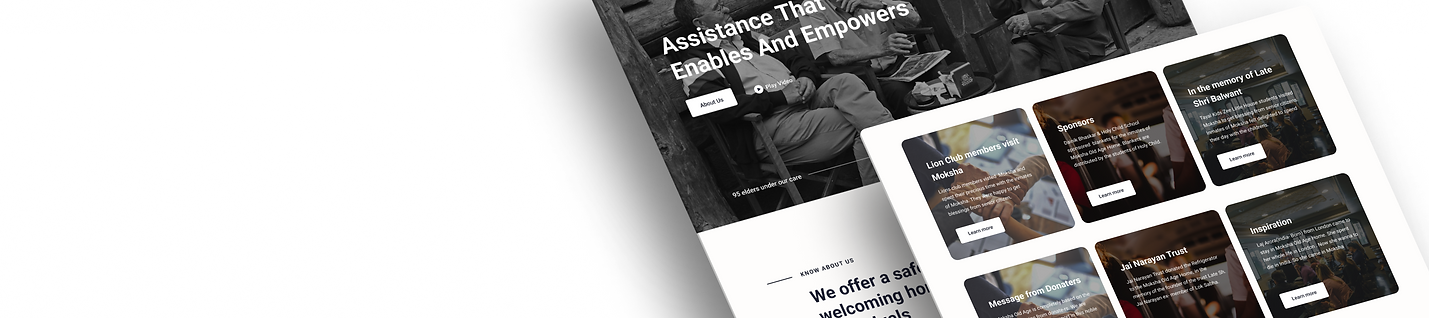
Providing Clear Information on the old age home's History and Safety Measures Upfront
Showcasing Services Offered to Build User Trust
Prominently Showcasing the Opportunity to Donate

Enhanced Header and Navigation for Improved Search Functionality
Maintaining Transparency in Donation Reporting
Real-Time Updates for Current Events and Happenings
Demonstrating the Allocation and Impact of Donations
Click to view High fidelity prototype
Outcome
I successfully enhanced the Moksha website, boosting usability by 40% based on positive user feedback. While current improvements address major challenges, further refinement is needed to ensure updated images and information align with user needs. I plan to revisit the project, conduct additional testing, and refine elements to ensure a seamless and emotionally resonant experience for Moksha website visitors.

Takeaway
Avoid varying UI implementations at the hi-fi wireframes stage to prevent user distraction from usability issues.
What did I learn?
I mastered holistic social media campaign management, employing analytics and surveys. By creating detailed user personas and using strategic design thinking, I addressed challenges effectively, enhancing brand visibility and audience engagement through data-driven decisions and continuous improvement.